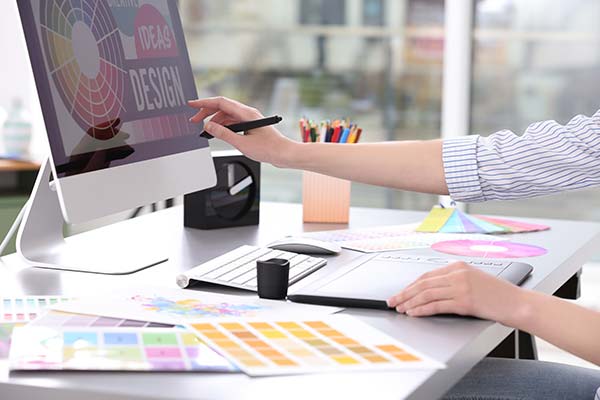
Does your company brochure and flyer design look like it may have been designed a decade ago?
Desktop Publishing software does not a designer make, any more than owning a pair of scissors makes a qualified hairdresser. If you are needing a professionally designed brochure, flyer, poster or anything else, you've come to the right place.
If your business presentation is important to you, and it should be, then the design of your promotional material may well make the difference between a sale, and not making a sale.
As graphic designers we know how important it is to present your business in the best possible light.
Are you proud to hand out or display your company brochure? Is your advertising material eye-catching, thought provoking and easy to evaluate? Are you unhappy with it, but not really sure why? If so, chances are good that you need a new or uplifted design presentation.
Before you plunge into it, consider some of the points that follow here.
Some thought and planning will go a long way to ensure that the creation of your material, which should project your business identity and image positively, is a presentation of which you can be proud.
A brochure is as important and fundamental a tool as your business card, however your business card usually introduces you as an individual, while a brochure presents either your entire business or a special promotion or facet of your business.
A brochure is an important marketing and sales tool which can create a lasting impression and you should ensure that it is a good one.
A well designed brochure is essential to the success of your business. It needs to effectively communicate the most important fundamentals of your business and your products or services.
It should reach out and move a prospective customer with an instant first impression. That can be a tall order.
No one will tell you what is wrong, but your brochure, flyer or advertisement, together with your contact details, will go straight to the round filing cabinet.
This means that you have not only wasted time and money, but you may have turned prospective customers away, who also might have formed a negative impression of your businesss, products or services.
So you saved a few hundred dollars on producing an unprofessionally designed brochure, but was it worth it?
A cheaply designed and produced brochure reflects badly on you. A business which economises on a brochure may also be seen as economising on service.
Your brochure should never attempt to cram too much information into a small space. It should not be a price sheet listing a huge range of products or services. Price lists serve a completely different purpose.
Trying to combine everything into an "all things to all people brochure", often results in a confusing and disorganized layout. You can be pretty sure that if your brochure is difficult to read, it won't be read.
A capable designer will cram it all in for you, but using tiny font sizes and images which are difficult to see may not generate effective results.
Using today's technology, you can use larger images and brief captions and encourage readers to visit your website for more information.
For larger businesses, an acceptable combination of eye catching brochure and specific details can be provided in a presentation folder.
One pocket holds your corporate brochure, the other pocket holds special deals, technical data, price lists and so forth.
We all receive brochures, flyers, mailouts etc and are exposed to advertising of all kinds all the time. Start to pay attention to how you react to them.
Some you might scan quickly and file for later reference. Others, you toss straight in the rubbish.
A few of them will actually cause you to sit up and pay attention. Why?
Take a good look at these and consider what attracts you. Study the ones that don't attract you and ask yourself why.
For the best brochure results, take into consideration that no matter how good your receptionist/wife/daughter or daughters boyfriend is with an office program, it is best not to have amateurs creating your business material, unless of course you want to look amateur.